
Attract More Clients with a Mobile-Optimised Salon Website
Published: December 08, 2023 · 3 min read
More than ever before, your clients and potential new customers are searching for local salons and making appointments on their mobile devices. Having a website that’s optimised for mobile browsing is now an essential element in web design for salons.
According to recent surveys, approximately 40% of online searches now originate on smartphones or tablets. And the majority of those mobile searches have local intent – looking for nearby businesses and service providers. For salons, that local search volume presents a major opportunity to drive bookings and grow your clientele.
But if your website isn’t mobile-friendly, you’re missing out on connecting with many of those potential customers. Your site needs to be responsive in order to provide an optimal viewing and navigation experience on any device.
Here are key elements to consider including in web development for salons to create a website that responds beautifully regardless of screen size:
Simplified Navigation Menu
Horizontal navigation bars that work well on desktop can become cumbersome and confusing on mobile devices. In salon web design, ensure your mobile navigation simplifies menu options with a “hamburger” icon to keep things clean and easy to use on a small screen.
Prominent Contact Info
Make it extremely quick and simple for visitors to call your salon directly from their mobile device. List your phone number prominently on every page and implement click-to-call functionality.
Optimised Images
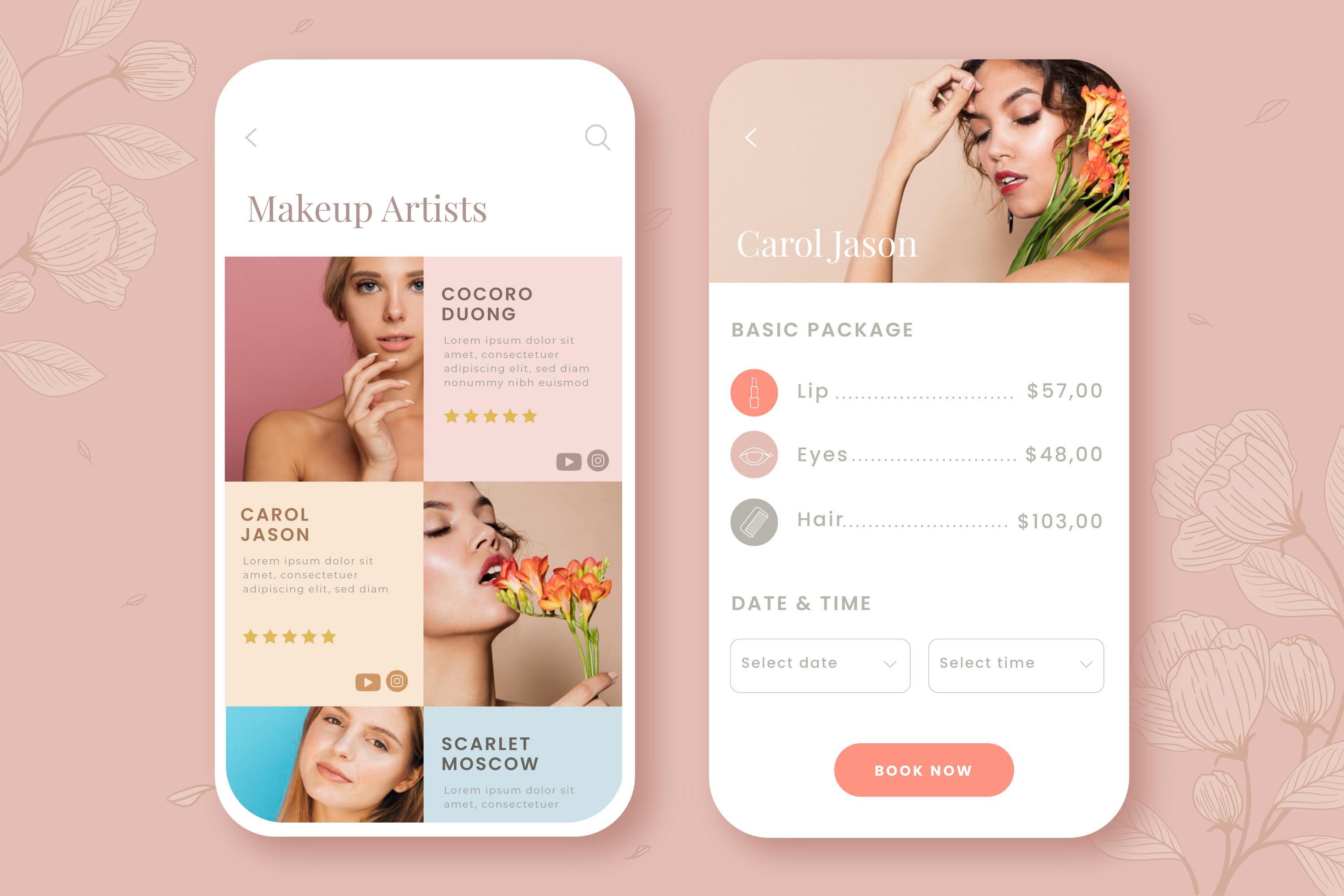
Large, high-quality images can lend visual impact on desktop, but be detrimental to mobile user experience by slowing load times. In your salon web design, use compressed image file formats optimised for faster loading on mobile networks.
Legible Typography
Your website content should be readable and legible regardless of device. Be sure typography elements like font selection, sizes, line heights and spacing are set with mobile reading in mind.
Efficient Booking Widget
Online booking capabilities are hugely important – both on desktop and mobile sites. Integrate your scheduling system or booking widget seamlessly across platforms for maximum convenience.
Location & Maps Integration
Enable location services within your mobile-optimised site design to surface a Google Map with directions directly to your salon. Users can click straight through to mapping apps for turn-by-turn guidance.
breakpoint CSS Layout
Implement breakpoint CSS rules so page layouts adapt seamlessly on mobile, automatically adjusting column widths and page elements to fit perfectly.
Page Speed Optimisations
With slower 3G/4G speeds, mobile pages that take too long to load will cause visitors to bounce to competitor sites. Audit page speed and implement compressions, caches and other technical enhancements to accelerate display.
In implementing these features within your overall web design framework, you’ll ensure salon website visitors have an equally great experience on mobile devices as they do on desktop. That expanded access and convenience pays dividends in the form of more calls, online bookings and new client appointments.
Conclusion
If your current site falls short for mobile users, now is the time for salon web development upgrades. With smartphone usage continuing its rapid rise year over year, the need for responsive, mobile-optimised websites will only intensify. Get ahead of the curve with an expert web design partner focused on creating mobile-friendly solutions tailored for salons.

Free Guide
Download our free guide to get 10-15+ new client bookings every week
Related Articles

Jarrod Harman
We specialise in helping impact-driven salons, clinics and spas get more bookings for their business and help them scale using the Grow A Salon Signature Growth System to become the number one go-to in their area.